Wednesday, 16 March 2016
OUGD502 END OF MODULE EVALUATION
This module has been a real eye opener to me in so many ways. The creative report gave me the opportunity to talk to creatives and find out more about their practice, which was really insightful to see what inspires them and what they're like as people, rather than just as creatives with a name. This also resulted in the publication that I am really pleased with, which is a comfort to know as editorial design is something I am interested in, so it's great to feel like I can actually do it. The self branding aspect made me think about who I am as an individual and as a creative, what do I enjoy, how do I want to be represented, how do other people see me? This year it was a lot easier to find an answer to these questions compared to last year, as I have a better, growing understanding of what I enjoy and what I don't, and how I see myself both on a personal level and as a creative. This consequently lead to a self branding outcome that I felt much better represented who I am, and that I was much more pleased with. Taking Care of Business was definitely an eye opener, it showed me exactly how much detail you have to think about when starting up a business, especially the funding, which I don't think I even half covered. It has shown me that yes, you can create your own business, but it shouldn't be done on a whim, and should be very carefully and thoroughly thought through first, to ensure it will logistically succeed. Time management on this brief has been surprisingly well, as up until that last few weeks I was convinced I was behind, but it turns out I wasn't which was a very pleasant surprise. I think I've just been chipping away at everything evenly this year, rather than focusing on one thing at a time like last year, which has resulted in a smoother workflow across all modules, and consequently less stress and no late nights furiously blogging.
OUGD502 ZACK WALLENFANG - TOPPS WAX WRAPPERS TRADING CARDS
Zack Wallenfang: the work has to be fun
Zack Wallenfang produced a large collection of caricatures on bubblegum wrappers, covering films as varied as Mad Max to Turbo Kid, and Kool Keith to Spring Breakers. This all came about by him taking part in Inktober, where every day of October artists must do one ink drawing. His The Texas Chainsaw Massacre drawing looked rather like TOPPS trading cards from the 1970's and 80's, which came with a sticker and a stick of bubblegum. This then lead him to think to place one of his drawings onto a scan of a TOPPS wax wrapper, creating the appearance of a fictional trading card series.
Here are some of my favourites


Why do I like them?
The colours, to start with, stand out at you like nothing else, you couldn't get much brighter if you tried. Yet all the colours on each wrapper work magnificently together, and portray a bold, strong style similar to that of the pop art movement. They all feature either one or two characters and a title in the main image section, and are wonderfully simple in that way, one image and text, nothing else gets in the way, the style and layout is consistent throughout each wrapper design, even though they cover such a range of films. The style of the illustrations are also really great, they manage to convey a lot of detail, in a relatively simple style, in that they use mainly flat block colours with black outlines to create detail. They are just so strong, and have so much punch to them, with the colours and style of the illustrations combined.
Zack Wallenfang produced a large collection of caricatures on bubblegum wrappers, covering films as varied as Mad Max to Turbo Kid, and Kool Keith to Spring Breakers. This all came about by him taking part in Inktober, where every day of October artists must do one ink drawing. His The Texas Chainsaw Massacre drawing looked rather like TOPPS trading cards from the 1970's and 80's, which came with a sticker and a stick of bubblegum. This then lead him to think to place one of his drawings onto a scan of a TOPPS wax wrapper, creating the appearance of a fictional trading card series.
Here are some of my favourites
Why do I like them?
The colours, to start with, stand out at you like nothing else, you couldn't get much brighter if you tried. Yet all the colours on each wrapper work magnificently together, and portray a bold, strong style similar to that of the pop art movement. They all feature either one or two characters and a title in the main image section, and are wonderfully simple in that way, one image and text, nothing else gets in the way, the style and layout is consistent throughout each wrapper design, even though they cover such a range of films. The style of the illustrations are also really great, they manage to convey a lot of detail, in a relatively simple style, in that they use mainly flat block colours with black outlines to create detail. They are just so strong, and have so much punch to them, with the colours and style of the illustrations combined.
OUGD502 BEX DAY
I wanted to see which other creatives used the same name as my brand, so I Googled "Bex" and found this really interesting photographer Bex Day from London, whose done work for American Apparel, Creative Review, It's Nice That, and Vice to name but a few.
What made me look into her work more, other than her name being my name, was the muted nature of her work, most of it has a very calm feeling to it, specifically these pieces below, which were some of my favourites. They manage to suggest to a story all in one shot, which isn't easily done, and it makes you wonder about each of the characters, where did they come from? What are they doing here? Why are they doing that/look like that/or are where they are? How did all that happen? Pylot 02 - Pete is a fabulous collection of photography, featured all about the man in the photographs, Pete I presume he is. She covers a topic in this set that many do not, cross dressing, and makes it look like an art, that Pete is someone genuinely interesting in what he does, and you should be interested too.
I just found her work really interested, with a great artistic style, one that draws you into her work, and gets you thinking.
 |
| Carbon Copy - Low Rates |
 |
| Garage - Manic Ovation |
 |
| Pylot 02 - Pete |
 |
| Vice - On Coney Island |
OUGD502 SELF BRANDING EVALUATION
Level 4 vs Level 5 branding


Level four branding is to the left and level five to the right. Just my looking briefly at the two versions of self branding, you can definitely see the similarities between them. Firstly, the colour scheme is the same, a kind of turquoisy-blue and white combination, which gives a very fresh and vibrant appearance in both examples. Also, this year I kept the name of my brand the same "bex" only choosing to show it in lowercase instead of uppercase, as in the level four designs it does look a little shouty despite the rounded typeface. I also chose a change of typeface for my brand name, instead of the rounded sans serif typeface, I chose Lust, an elegant serif typeface, as I thought this better represented my personality and provided a lot more interest on the front of the card than a sans serif would. Similarly between both examples of self branding, there is a lot of white space, or blank space for writing on the backs, something I think is really important for a business card to have, so you can write personalised messages for each person you give a card to. A major different between these cards is their production. For level four The business cards were digitally printed, which gives a really flat appearance. In level five I wanted to reflect more my love of analogue techniques (which I did subtly in level four my using a mono print texture for part of the front), and produced the front of the business cards using Brusho powders, creating a large sheet of stock in this fabulous colourful pattern, and then cutting out the business card shapes. This makes a much more tactile feel, and the colours are great and bright, being the real thing not a photograph. The "bex" text was produced by cutting it out of white vinyl and then sticking it onto the front of the card, which produced a gloss effect with the text, as I sued gloss vinyl, which contrasts nicely with the matte appearance of the Brusho pattern. I thought this was a much more clear and effective way to demonstrate my love of both analogue and digital techniques, the Brusho reflecting the analogue and the vinyl and digitally printed backs representing the digital side.
One thing that has improved since last year is my photography skills as can be seen in these two photographs, as I think the level 5 branding photographs not only have a much more professional construction but also the colours are much more appealing, as I've discovered the auto tone, auto contrast and auto colour tools on Photoshop which are a life saver.
For this brief I have worked quite efficiently on it, which have resulted in me not having to rush towards the end to finish things, which resulted in business cards that I am really proud of and would actually give out to creatives, and produced to a standard and will all the aspects I wanted to experiment with and include.
Tuesday, 15 March 2016
OUGD502 STUDIO BRIEF ONE - CREATIVE REPORT EVALUATION
Evaluation
This is one of few briefs that I am genuinely really pleased with. Getting responses from two creatives was an achievement I am quite proud of, and the Valentine’s Cards were an unusual idea that combined creativity with contacting professionals that produced a really unique and potentially effective outcome. This brief was also finished in good time, meaning I didn’t have to rush to complete it, which resulted in a very relaxed, unstressful process. This could show that my time management is improving, and I'm learning to juggle all the different projects more effectively. One thing I would of done differently was order in more of the Heaven 42 stock as samples or see if I could buy it from GF Smith or one of their suppliers, to use fully for the content. This would of resulted in a more completed report, rather than just suggesting what stock I would of used. Another thing I would of experimented more with was the binding method, as I went for the most straightforward, clean and functional option, which does work effectively and provides the report with a simple aesthetic. However, it would of been interesting to see how perfect bind and saddle stitch would of looked in comparison. Perfect bind might not of worked as the report does have quite few pages, but I could of experimented with different coloured topped paper on the bind, creating a coloured strip down each side of the cover, which may of added more interest. With saddle stitch I could of used a really funky coloured thread, maybe fluorescent pink or silver, even green, to give it more interest and added elements to it. I also could of screen printed the titles on the front, or even foiled, to give it a more high end aesthetic, however at the time I thought these processes unnecessary and didn’t even consider it, as I was focused on finishing the brief as efficiently as possible, to a standard I am pleased with, which I am.
Overall, very chuffed with this brief, and found it really interesting talking to Dullife Lingerie and Underground Undies, as they are two people I've followed for a while now so it was great to have a purpose to talk to them.
Sunday, 13 March 2016
OUGD502 BEX TAKES THE INTERNET
For creatives to get their name and work out in the world, one of the best ways is via the internet, as this sends out your work all over the world. As I am a creative, all my work is visual, so I thought the most appropriate social media site to showcase my work would be Instagram, as this is solely photographs and videos, and a lot of the creative people I am inspired by, I've found using Instagram. Instagram can also only be uploaded to using a mobile app on your phone, which works really well for me as this means whenever I have a free moment I can upload a new piece of work, I don't have to be sat at my laptop do to so. This also makes it a very easy process to upload, meaning I am more likely to upload more content.
However, I thought I needed something a bit more solid and professional to go alongside this Instagram account, so I created a website using Cargo Collective, a site for creatives to showcase their work alongside one another, whilst also being able to be accessed independently as well.
Instagram


Website (cargo collective)


However, I thought I needed something a bit more solid and professional to go alongside this Instagram account, so I created a website using Cargo Collective, a site for creatives to showcase their work alongside one another, whilst also being able to be accessed independently as well.


Website (cargo collective)


OUGD502 BERLIN
As a course we took a trip to Berlin for a few days to explore the art and culture there, as well as a lot of sightseeing in my case!
Bauhaus Archive
This was really interesting to see the style of architecture of the buildings, and to think that this would of been how some people lived back in the day.


Berlin Zoological Gardens
This trip was to research different animals and plants that would be found in the rainforest for OUGD505 Studio Brief Two.


Berlin Zoological Gardens Aquarium
The aquarium was part of the Zoological Gardens, where lots of exotic fish could be found, again to be used for OUGD505 Studio Brief Two.


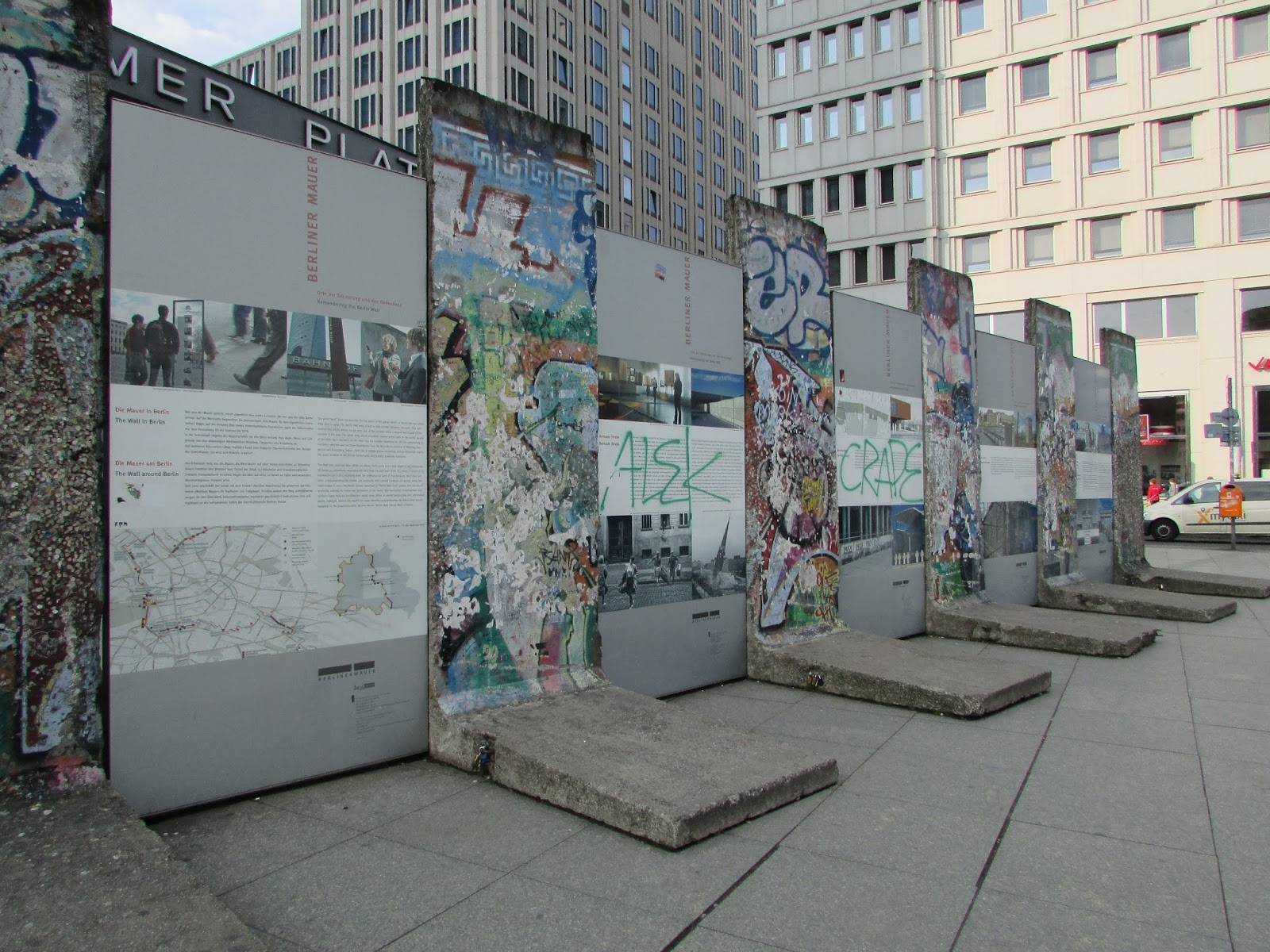
Piece of the Berlin Wall
Sections of the Berlin Wall were on display outside a station on the street.


Berlin Wall East Side Gallery
East Side Gallery showcases works of art on the still standing Berlin Wall.


Berlinische Galerie


---


War Memorial by Checkpoint Charlie

Checkpoint Charlie


Holocaust Memorial
Walking through this memorial, you get a sense of what it would of been like to be held captive during this time, as you start off in the daylight walking amongst these stones, and then slowly less of the surrounding area can be seen until you're encased with these stones towering above you, where you can only see what's ahead, and it stretches so far ahead of you, and this makes you walk faster to get to the end, and then all of a sudden you're back in the daylight and can see your surroundings again, and you feel free.


Brandenburg Gate

Galeries Lafayette Window Display
This was a really interesting window display where LED neon tubes framed the legs of the mannequin, which gave it a kind of sci-fi feel.

Ritter Sport Chocolate Museum
These bears are all around Berlin, and they are fabulous and each one is painted differently.

Hem
"The Hem collection is designed to fit perfectly into the way people live today. From refined everyday objects to elegant statement pieces, Hem makes original, high-quality designs affordable to people everywhere. Hem ships directly to you in 35 countries via our online shop and Hem stores, and we distribute via partners to more than 50 countries."
What caught my eye was the fabulous typeface on this building, as at the time I had no idea what was behind those windows, it looked a little like offices, but the typeface made you think there was something special in there.


Going to Berlin was a really interesting experience, and I don't know what I was expecting from it, but I didn't imagine there'd be so many concrete buildings, although I guess this is due to Berlin needing to be rebuilt quickly after the war. I saw some really interesting things, however I wouldn't go back again, as there really was a lot of concrete and tall, boring buildings.
Bauhaus Archive
This was really interesting to see the style of architecture of the buildings, and to think that this would of been how some people lived back in the day.


Berlin Zoological Gardens
This trip was to research different animals and plants that would be found in the rainforest for OUGD505 Studio Brief Two.
 |
| Zoo main entrance. |


Berlin Zoological Gardens Aquarium
The aquarium was part of the Zoological Gardens, where lots of exotic fish could be found, again to be used for OUGD505 Studio Brief Two.

 |
| The typeface for Aquarium was really interesting, in gold which made it look quite royal against the stone building. |


Piece of the Berlin Wall
Sections of the Berlin Wall were on display outside a station on the street.


Berlin Wall East Side Gallery
East Side Gallery showcases works of art on the still standing Berlin Wall.


Berlinische Galerie
 |
| How does this sculpture work? Gravity defying and interesting. |
 |
| This gallery had a really interesting staircase in the main gallery space, a great architectural feature. |
 |
| This was a really interesting exhibition where trees have been photographed against colourful, interesting architectural backgrounds. |


---


War Memorial by Checkpoint Charlie

Checkpoint Charlie


Holocaust Memorial
Walking through this memorial, you get a sense of what it would of been like to be held captive during this time, as you start off in the daylight walking amongst these stones, and then slowly less of the surrounding area can be seen until you're encased with these stones towering above you, where you can only see what's ahead, and it stretches so far ahead of you, and this makes you walk faster to get to the end, and then all of a sudden you're back in the daylight and can see your surroundings again, and you feel free.


Brandenburg Gate

Galeries Lafayette Window Display
This was a really interesting window display where LED neon tubes framed the legs of the mannequin, which gave it a kind of sci-fi feel.

Ritter Sport Chocolate Museum
These bears are all around Berlin, and they are fabulous and each one is painted differently.

Hem
"The Hem collection is designed to fit perfectly into the way people live today. From refined everyday objects to elegant statement pieces, Hem makes original, high-quality designs affordable to people everywhere. Hem ships directly to you in 35 countries via our online shop and Hem stores, and we distribute via partners to more than 50 countries."
What caught my eye was the fabulous typeface on this building, as at the time I had no idea what was behind those windows, it looked a little like offices, but the typeface made you think there was something special in there.


 |
| Interesting brickwork of a housing building opposite the Berlinische Gallery. |
 |
| Another interesting housing block on the streets of Berlin round the corner from the Berlinische Gallery. Love the arched walkway and the sloping windows. |
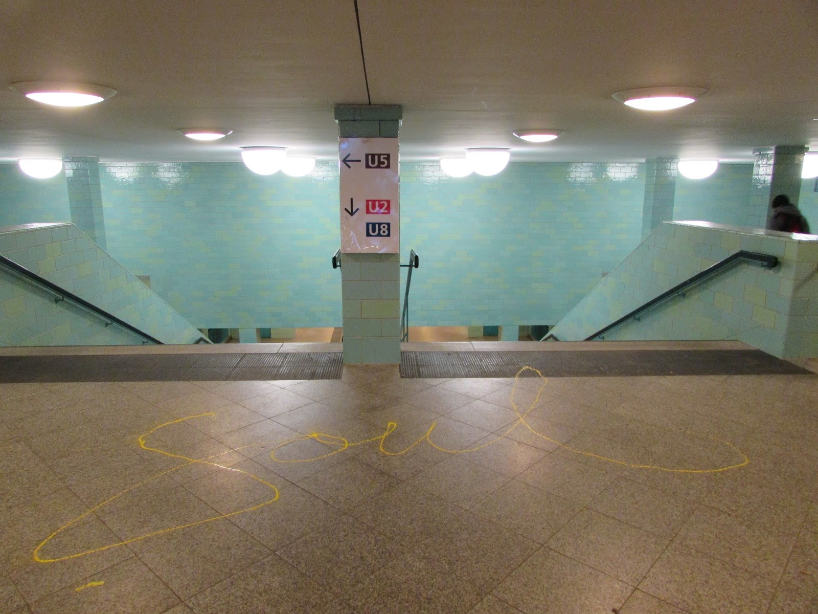 |
| Soul on the floor going into the U-Bahn. This writing was also found on the platform of another U-Bahn station, so I think someone goes around writing this in places, which is a really interesting idea as it just lifts you up a little bit and distracts you from the normal stuff you're doing. |
Going to Berlin was a really interesting experience, and I don't know what I was expecting from it, but I didn't imagine there'd be so many concrete buildings, although I guess this is due to Berlin needing to be rebuilt quickly after the war. I saw some really interesting things, however I wouldn't go back again, as there really was a lot of concrete and tall, boring buildings.
Subscribe to:
Comments (Atom)