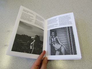
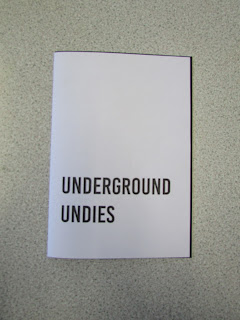
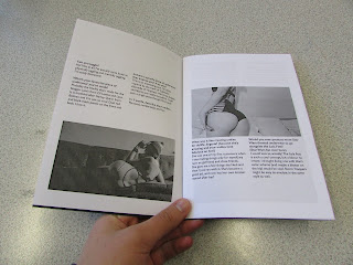
I produced several mock ups to see exactly what the quality of the photographs look like printed, and how the colours are as well. I also wanted to see how the layout works with the 2in1 publication, and the positioning of photographs as well, are there too many, are they too big, are some included to fill space rather than for a purpose?
Mock up one:
In this mock up explored the initial layout of the Dullife Lingerie interview, before I got a response from Underground Undies. I also experimented with the front cover as well, as I was unsure about the layout of text and sizing.
Mock up two:
This mock up shows how the photographs will turn out printed in colour, and how high quality the photographs are, whether they're pixellated or fuzzy. This shows me which photographs should be changed due to low quality.
Mock up three:
This is a mock up of the whole 2in1 publication, as Underground Undies responded. This shows how the 2in1 works, and all the images together, whether there's too many female bums and note enough men in the Underground Undies section. I also experimented with a different stock for the front cover, using a dark blue Plike stock by G F Smith, to give it more of a luxurious feel to it. However, as you can see, the stock is so dark that the text can't be seen clearly at all. I also tried out a much more simplistic front cover, using only the name of the creative, as before there was too much text and it didn't look clean, but cluttered. This creates a much more clean cut and bold appearance, you don't have to read through other text to find out the creatives name.


No comments:
Post a Comment