Inspiration for business cards
The two pieces below are past pieces of my work, which I had great enjoyment doing, and this also inspired the bright, colourful, watercolour style of the business cards.
 |
| Acne Studios business cards. The typeface is hip and easy to read, as well as being contemporary and simple as well. The simplicity of small, black text on a pink stock creates a slightly feminine but bold appearance. This is definitely something I'd like to achieve on the back, as well it leaves room for any writing on the back of the card. |
 |
| Acne Studios typeface would be ideal for the text on the back of my business cards, however it was designed specifically for Acne by Johannes Svartholm in collaboration with Acne, so isn't available to buy or for free download. |
Using Brusho:
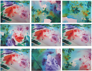
I'd used Brusho powders for another PPP study task, where I had to present myself, and thought they created a great effect, so used them again for this studio brief. Now having more knowledge of how Brusho works and the colours move, I knew which colours to put next to which, so that minimal brown areas were created.
 |
| Brusho piece. The colours are very varied, and I tried to get a good mix of firework style areas and flatter colours, to create more interest in the page. |
Production:
For one set of business card fronts they were simply printed out using photographs of the Brusho colours and black or white bex's in the two different typefaces. For the other set, using a window viewer the size of a business card, the card sizes were drew onto the Brusho colours itself, using up as much of the sheet as possible, and getting the most attractive areas in one card size. The bex text was then cut out of white glossy vinyl using the vinyl cutter and stuck onto the actual Brusho cards, which created a subtle shine effect, with two different textures contrasting, which gave more emphasis to the bex.
Photographs:
Evaluation:
With these business cards I printed two different typefaces on them, as I was unsure which best reflected me as an individual, and worked best with the patterned background. Looking at the business cards printed out, the serif typeface works better, as this better reflects my personality and doesn't look too busy with the patterned background either. One slight issue is that in the photographs the "bex" doesn't stand out too strongly being white, mainly on the actual Brusho and vinyl business cards, as the pattern isn't concentrated enough on a lot of the cards, so there is a lot of white, and not as much contrast. However when looking at the Brusho colours as a whole, there isn't a lot of space for more added colour, as the majority of the piece is filled.


No comments:
Post a Comment