Karel Martens is a Dutch Graphic Designer who has specialised in typographic design, however has produced these series of mono prints which I have found and think are particularly interesting.
 |
| This design is really interesting with the use of different shapes, circles, rectangles and a random shape too. I also really lie the colour choices, as the pink makes this print look less masculine and brightens the page up as well. The different shades of blue create a more varied colour palette. All of this colour is toned down by the grey however, which neutralises and grounds the whole print, being a much more neutral colour. There are holes cut into the shapes as well, which creates even more colour variation as the shapes overlap and different colours come through different parts. Some kind of overlapping mono printed design could be really interesting to produce for this Self Branding brief, and would produce wonderful colours as well if the correct base colours were used. |
 |
| This is a similar mono print to the previous on, actually using one of the same stencils to produce this design and using the same colours too. In this print however an "M" has been included, printed over the pink shape, and looks like it was printed using one stencil which was rearranged for each stroke of the letterform to create the shape. You can't really see much pink through the blue M except for through the holes which were left blank anyway, which suggests that the blue was printed on top of the pink, contrary to the previous print, where the pink was printed on top of the blue so more of the pink was visible. This makes the blue stand out a lot better on this print, however lessens the colour variation. This is something I should consider when printing my own designs. I also quite like the green line that is placed across the lowest point of the "h" to make it look like the 'H' is standing on something, perhaps grass due to it's colour. This line also creates a different kind of shape in this print, as all the other shapes used are quite blocky and full of colour, whereas this line is thin and only suggests at colour, it doesn't overwhelm the page. |
 |
| This is a different style of design to the two previous ones, although still uses the same mono printed technique, and the stencil shapes having holes in them. This print is a lot more spontaneous and less organised than the previous designs, with smudges across the paper inside of the box shape, making it look a little like a toolbox, especially with the tool style shapes printed. I like the smudges of paint across the page, as it looks a little like coloured powder, and makes all the objects appear as if they are floating within the box even more. They also make this design appear less precise, which is the exact nature of mono printing, it is not a vert precise printing method, and you never know the exact outcome until it is produced. The boldness of the black box over the shapes contrasts the vague and colourful objects, and holds all the objects in one place, containing them. It also creates a nice border as well that it rather unusual not being precise and simple, yet still holds everything in place, separating the inside contents of the box to what is outside. |
 |
| This is a slightly different mono pritned design, where only long rectangles and a circle have been used to form this print. The rectangles have very little holes in them, almost pin pricks, which create an interesting but extremely subtle texture to the prints. Some of the rectangles also overlap as well, which creates a variation in colour that is only very slight but still shows the variations in colour. I'm not sure that the purpose of the little circle is, as it is in great contrast to the rest of the shapes on this print, but perhaps it was included to create imbalance, as there is only one circle on one side of the print, almost weighing it down. I think the colour choices of this print work effectively together, and all compliment one another, with the yellow and orange giving the print a warm appearance, and the blue contrasts this, and separates one from another by being physically in between them, and creating balance in the print so it isn't all warm colours. |
 |
| This is a much more recent print of Martens, produced in 2004, and I think this is one of my favourite prints of his. The design is so simple, yet manages to create so many different colours within it, simply by printing colour on top of colour on top of colour to create this effect. The colours produced are also very vibrant and bold, with the main colours of the circles contrasting with one another creating this three wheel effect. The other colours revealed in the print also somehow look joined up to one another, perhaps because one stripe of paper was used to cover parts of each circle, that joined each circle together, so the lines appear to start from one circle and continue onto the next, you hardly notice the split between the circles. |
These are some more mono prints of Karel Martens' which I thought were interesting and eye catching, however didn't feel I needed to annotate them as such, as a lot of them are very similar to the prints above and to one another, and my reasons for liking these prints of Martens is generally the same; the use of colour, bold shapes, overlay of colour, simplicity of design, contrast between shape and colour etc etc.
 |
| Vibrant use of contrasting, bold colours. Shapes split off into different sections revealing new colours. |
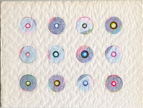 |
| Use of pastel colours uncommon for Martens. Delicate and feminine. |
 |
| Varying weights of circles creates interesting, simple pattern. Cogs in a mechanism? |
 |
| Looks like waffles. Split in half by colour interesting. |
 |
| Linear style of this pattern. Looks a little like a spirograph shape holder. Simple colours powerful design. |
 |
| Contrasting colours work well together, green and pink combination effective. |
 |
| Shape gets larger and larger, interesting, mirror like. |
 |
| Circles are dark yet shown colours bright colours oft he rainbow, interesting contrast. |
 |
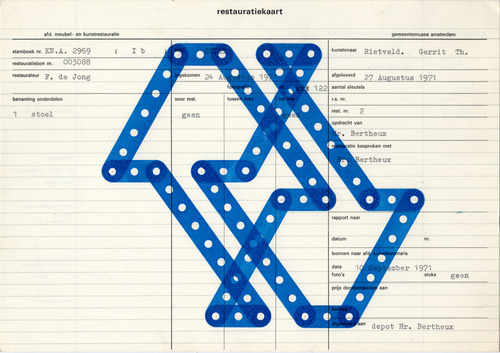
| Linear format of this print looks like a chair, almost diagrammatical. |
 |
| Simplicity of this design makes it interesting. Looks like two CD's put together. "G" stamp looks kind of army style with stencilled quality. |
 |
| Combination of pastel and bright colours create nice contrast and compliment one another highlighting differences. |
 |
| Very bright, bold, crazed pattern. Simple shapes help make this design geometrical and relatively organised, with equal spacing for example. |
 |
| Overlapping of two simple shapes effective to create this number 9 shape, with colours complimenting one another. |
 |
| Another 3 circle design, with different colour-ways creating more minty design, slightly feminine due to pint and turquoise combination. |
 |
| Very bright and girlish colour combination. Almost fluorescent colour choices, very 60's. |
Researching into Karel Martens has been of great use to me, as before starting this course I knew nothing about mono printing, and until only a few weeks ago I had never even done mono printing before, so it is really exciting for me to find a designer who has mono printed before and whose work is along the same lines as something I want to produce for my self branding brief, and that I find fascinating, not just one piece of his work but the vast majority of it. It has shown me so many different things you can do with mono printing, and that sometimes the simple designs are the ones that work the best. This is definitely something I want to apply to my designs, and I feel a lot more mono printing experimentation is needed to see what kind of colour-ways and shapes work the best.
No comments:
Post a Comment